Comment créer une barre de progression de style circulaire
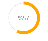
J'ai besoin d'aide pour mettre en œuvre une barre de progression circulaire comme celle-ci:

Comment dois-je implémenter le cercle à remplir en augmentant la propriété Value?
Vous avez quelques options - la première consiste à modéliser le contrôle ProgressBar. Cela s'avère un peu délicat. J'ai écrit un article de blog qui décrit comment tiliser un ViewModel attaché pour obtenir l'effet requis .
L'autre alternative consiste à créer votre propre contrôle à partir de zéro. Vous pouvez effectuer les opérations suivantes:
- Créer un nouveau contrôle utilisateur
- Ajoutez-y de nouvelles propriétés de dépendance Value, Maximum et Minimum.
- Gérez les événements de modification des propriétés Valeur, Maximum et Minimum dans votre contrôle utilisateur pour calculer une propriété Angle.
- Construisez deux 'pie pieces' dans le code derrière (voir ce post ) et ajoutez-les à l'interface utilisateur.
C'est un peu délicat mais pas impossible. Voici mon implémentation utilisant des animations fluides pour vous guider. Les convertisseurs de valeur doivent être utilisés pour créer un CircularProgressBar.
CircularProgressBar.cs
 public partial class CircularProgressBar : ProgressBar
{
    public CircularProgressBar()
    {
        this.ValueChanged += CircularProgressBar_ValueChanged;
    }

    void CircularProgressBar_ValueChanged(object sender, RoutedPropertyChangedEventArgs<double> e)
    {
        CircularProgressBar bar = sender as CircularProgressBar;
        double currentAngle = bar.Angle;
        double targetAngle = e.NewValue / bar.Maximum * 359.999;

        DoubleAnimation anim = new DoubleAnimation(currentAngle, targetAngle, TimeSpan.FromMilliseconds(500));
        bar.BeginAnimation(CircularProgressBar.AngleProperty, anim, HandoffBehavior.SnapshotAndReplace);
    }

    public double Angle
    {
        get { return (double)GetValue(AngleProperty); }
        set { SetValue(AngleProperty, value); }
    }

    // Using a DependencyProperty as the backing store for Angle.  This enables animation, styling, binding, etc...
    public static readonly DependencyProperty AngleProperty =
        DependencyProperty.Register("Angle", typeof(double), typeof(CircularProgressBar), new PropertyMetadata(0.0));

    public double StrokeThickness
    {
        get { return (double)GetValue(StrokeThicknessProperty); }
        set { SetValue(StrokeThicknessProperty, value); }
    }

    // Using a DependencyProperty as the backing store for StrokeThickness.  This enables animation, styling, binding, etc...
    public static readonly DependencyProperty StrokeThicknessProperty =
        DependencyProperty.Register("StrokeThickness", typeof(double), typeof(CircularProgressBar), new PropertyMetadata(10.0));
}
AngleToPointConverter.cs
class AngleToPointConverter : IValueConverter
{

    public object Convert(object value, Type targetType, object parameter, System.Globalization.CultureInfo culture)
    {
        double angle = (double)value;
        double radius = 50;
        double piang = angle * Math.PI / 180;

        double px = Math.Sin(piang) * radius + radius;
        double py = -Math.Cos(piang) * radius + radius;

        return new Point(px, py);
    }

    public object ConvertBack(object value, Type targetType, object parameter, System.Globalization.CultureInfo culture)
    {
        throw new NotImplementedException();
    }
}
AngleToIsLargeConverter.cs
class AngleToIsLargeConverter : IValueConverter
{

    public object Convert(object value, Type targetType, object parameter, System.Globalization.CultureInfo culture)
    {
        double angle = (double)value;

        return angle > 180;
    }

    public object ConvertBack(object value, Type targetTypes, object parameter, System.Globalization.CultureInfo culture)
    {
        throw new NotImplementedException();
    }
}
App.xaml
<Application x:Class="WpfApplication1.App"
         xmlns="http://schemas.Microsoft.com/winfx/2006/xaml/presentation"
         xmlns:x="http://schemas.Microsoft.com/winfx/2006/xaml"
         StartupUri="MainWindow.xaml"
         xmlns:my="clr-namespace:WpfApplication1">
<Application.Resources>
    <my:AngleToPointConverter x:Key="prConverter"/>
    <my:AngleToIsLargeConverter x:Key="isLargeConverter"/>

    <Style x:Key="circularProgressBar" TargetType="my:CircularProgressBar">
        <Setter Property="Value" Value="10"/>
        <Setter Property="Maximum" Value="100"/>
        <Setter Property="StrokeThickness" Value="10"/>
        <Setter Property="Template">
            <Setter.Value>
                <ControlTemplate TargetType="my:CircularProgressBar">
                        <Canvas Width="100" Height="100">
                        <Ellipse Width="100" Height="100" Stroke="LightGray"
                                     StrokeThickness="1"/>

                        <Path Stroke="{TemplateBinding Background}"
                                  StrokeThickness="{TemplateBinding StrokeThickness}">
                                <Path.Data>
                                    <PathGeometry>
                                        <PathFigure x:Name="fig" StartPoint="50,0">
                                            <ArcSegment RotationAngle="0" SweepDirection="Clockwise"
                                                        Size="50,50"
                                                        Point="{Binding Path=Angle, Converter={StaticResource prConverter}, RelativeSource={RelativeSource FindAncestor, AncestorType=ProgressBar}}"
                                                        IsLargeArc="{Binding Path=Angle, Converter={StaticResource isLargeConverter}, RelativeSource={RelativeSource FindAncestor, AncestorType=ProgressBar}}"
                                                        >
                                            </ArcSegment>
                                        </PathFigure>
                                    </PathGeometry>
                                </Path.Data>
                            </Path>
                            <Border Width="100" Height="100">
                                <TextBlock Foreground="Gray" HorizontalAlignment="Center" VerticalAlignment="Center"
                                       Text="{Binding Path=Value, StringFormat={}%{0},
                                RelativeSource={RelativeSource TemplatedParent}}"
                                           FontSize="{TemplateBinding FontSize}"/>
                            </Border>
                        </Canvas>

                </ControlTemplate>
            </Setter.Value>
        </Setter>
    </Style>
</Application.Resources>
Il peut être plus personnalisé en ajoutant quelques propriétés supplémentaires telles que InnerRadius, Radius, etc.
Je sais que c'est un vieux problème, mais de toute façon voici ma solution:
POUR LES WINFORMS:
using System;
using System.ComponentModel;
using System.Drawing;
using System.Drawing.Drawing2D;
using System.Windows.Forms;
public class CircularProgressBar : Control
{
#region Enums
public enum _ProgressShape
{
Round,
Flat
}
public enum _TextMode
{
None,
Value,
Percentage,
Custom
}
#endregion
#region Private Variables
private long _Value;
private long _Maximum = 100;
private int _LineWitdh = 1;
private float _BarWidth = 14f;
private Color _ProgressColor1 = Color.Orange;
private Color _ProgressColor2 = Color.Orange;
private Color _LineColor = Color.Silver;
private LinearGradientMode _GradientMode = LinearGradientMode.ForwardDiagonal;
private _ProgressShape ProgressShapeVal;
private _TextMode ProgressTextMode;
#endregion
#region Contructor
public CircularProgressBar()
{
SetStyle(ControlStyles.SupportsTransparentBackColor, true);
SetStyle(ControlStyles.Opaque, true);
this.BackColor = SystemColors.Control;
this.ForeColor = Color.DimGray;
this.Size = new Size(130, 130);
this.Font = new Font("Segoe UI", 15);
this.MinimumSize = new Size(100, 100);
this.DoubleBuffered = true;
this.LineWidth = 1;
this.LineColor = Color.DimGray;
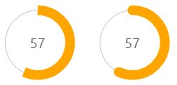
Value = 57;
ProgressShape = _ProgressShape.Flat;
TextMode = _TextMode.Percentage;
}
#endregion
#region Public Custom Properties
/// <summary>Determina el Valor del Progreso</summary>
[Description("Valor Entero que determina la posision de la Barra de Progreso."), Category("Behavior")]
public long Value
{
get { return _Value; }
set
{
if (value > _Maximum)
value = _Maximum;
_Value = value;
Invalidate();
}
}
[Description("Obtiene o Establece el Valor Maximo de la barra de Progreso."), Category("Behavior")]
public long Maximum
{
get { return _Maximum; }
set
{
if (value < 1)
value = 1;
_Maximum = value;
Invalidate();
}
}
[Description("Color Inicial de la Barra de Progreso"), Category("Appearance")]
public Color BarColor1
{
get { return _ProgressColor1; }
set
{
_ProgressColor1 = value;
Invalidate();
}
}
[Description("Color Final de la Barra de Progreso"), Category("Appearance")]
public Color BarColor2
{
get { return _ProgressColor2; }
set
{
_ProgressColor2 = value;
Invalidate();
}
}
[Description("Ancho de la Barra de Progreso"), Category("Appearance")]
public float BarWidth
{
get { return _BarWidth; }
set
{
_BarWidth = value;
Invalidate();
}
}
[Description("Modo del Gradiente de Color"), Category("Appearance")]
public LinearGradientMode GradientMode
{
get { return _GradientMode; }
set
{
_GradientMode = value;
Invalidate();
}
}
[Description("Color de la Linea Intermedia"), Category("Appearance")]
public Color LineColor
{
get { return _LineColor; }
set
{
_LineColor = value;
Invalidate();
}
}
[Description("Ancho de la Linea Intermedia"), Category("Appearance")]
public int LineWidth
{
get { return _LineWitdh; }
set
{
_LineWitdh = value;
Invalidate();
}
}
[Description("Obtiene o Establece la Forma de los terminales de la barra de progreso."), Category("Appearance")]
public _ProgressShape ProgressShape
{
get { return ProgressShapeVal; }
set
{
ProgressShapeVal = value;
Invalidate();
}
}
[Description("Obtiene o Establece el Modo como se muestra el Texto dentro de la barra de Progreso."), Category("Behavior")]
public _TextMode TextMode
{
get { return ProgressTextMode; }
set
{
ProgressTextMode = value;
Invalidate();
}
}
[Description("Obtiene el Texto que se muestra dentro del Control"), Category("Behavior")]
public override string Text { get; set; }
#endregion
#region EventArgs
protected override void OnResize(EventArgs e)
{
base.OnResize(e);
SetStandardSize();
}
protected override void OnSizeChanged(EventArgs e)
{
base.OnSizeChanged(e);
SetStandardSize();
}
protected override void OnPaintBackground(PaintEventArgs p)
{
base.OnPaintBackground(p);
}
#endregion
#region Methods
private void SetStandardSize()
{
int _Size = Math.Max(Width, Height);
Size = new Size(_Size, _Size);
}
public void Increment(int Val)
{
this._Value += Val;
Invalidate();
}
public void Decrement(int Val)
{
this._Value -= Val;
Invalidate();
}
#endregion
#region Events
protected override void OnPaint(PaintEventArgs e)
{
base.OnPaint(e);
using (Bitmap bitmap = new Bitmap(this.Width, this.Height))
{
using (Graphics graphics = Graphics.FromImage(bitmap))
{
graphics.InterpolationMode = System.Drawing.Drawing2D.InterpolationMode.HighQualityBilinear;
graphics.CompositingQuality = System.Drawing.Drawing2D.CompositingQuality.HighQuality;
graphics.PixelOffsetMode = System.Drawing.Drawing2D.PixelOffsetMode.HighQuality;
graphics.SmoothingMode = System.Drawing.Drawing2D.SmoothingMode.AntiAlias;
//graphics.Clear(Color.Transparent); //<-- this.BackColor, SystemColors.Control, Color.Transparent
PaintTransparentBackground(this, e);
//Dibuja el circulo blanco interior:
using (Brush mBackColor = new SolidBrush(this.BackColor))
{
graphics.FillEllipse(mBackColor,
18, 18,
(this.Width - 0x30) + 12,
(this.Height - 0x30) + 12);
}
// Dibuja la delgada Linea gris del medio:
using (Pen pen2 = new Pen(LineColor, this.LineWidth))
{
graphics.DrawEllipse(pen2,
18, 18,
(this.Width - 0x30) + 12,
(this.Height - 0x30) + 12);
}
//Dibuja la Barra de Progreso
using (LinearGradientBrush brush = new LinearGradientBrush(this.ClientRectangle,
this._ProgressColor1, this._ProgressColor2, this.GradientMode))
{
using (Pen pen = new Pen(brush, this.BarWidth))
{
switch (this.ProgressShapeVal)
{
case _ProgressShape.Round:
pen.StartCap = LineCap.Round;
pen.EndCap = LineCap.Round;
break;
case _ProgressShape.Flat:
pen.StartCap = LineCap.Flat;
pen.EndCap = LineCap.Flat;
break;
}
//Aqui se dibuja realmente la Barra de Progreso
graphics.DrawArc(pen,
0x12, 0x12,
(this.Width - 0x23) - 2,
(this.Height - 0x23) - 2,
-90,
(int)Math.Round((double)((360.0 / ((double)this._Maximum)) * this._Value)));
}
}
#region Dibuja el Texto de Progreso
switch (this.TextMode)
{
case _TextMode.None:
this.Text = string.Empty;
break;
case _TextMode.Value:
this.Text = _Value.ToString();
break;
case _TextMode.Percentage:
this.Text = Convert.ToString(Convert.ToInt32((100 / _Maximum) * _Value));
break;
default:
break;
}
if (this.Text != string.Empty)
{
using (Brush FontColor = new SolidBrush(this.ForeColor))
{
int ShadowOffset = 2;
SizeF MS = graphics.MeasureString(this.Text, this.Font);
SolidBrush shadowBrush = new SolidBrush(Color.FromArgb(100, this.ForeColor));
//Sombra del Texto:
graphics.DrawString(this.Text, this.Font, shadowBrush,
Convert.ToInt32(Width / 2 - MS.Width / 2) + ShadowOffset,
Convert.ToInt32(Height / 2 - MS.Height / 2) + ShadowOffset
);
//Texto del Control:
graphics.DrawString(this.Text, this.Font, FontColor,
Convert.ToInt32(Width / 2 - MS.Width / 2),
Convert.ToInt32(Height / 2 - MS.Height / 2));
}
}
#endregion
//Aqui se Dibuja todo el Control:
e.Graphics.DrawImage(bitmap, 0, 0);
graphics.Dispose();
bitmap.Dispose();
}
}
}
private static void PaintTransparentBackground(Control c, PaintEventArgs e)
{
if (c.Parent == null || !Application.RenderWithVisualStyles)
return;
ButtonRenderer.DrawParentBackground(e.Graphics, c.ClientRectangle, c);
}
/// <summary>Dibuja un Circulo Relleno de Color con los Bordes perfectos.</summary>
/// <param name="g">'Canvas' del Objeto donde se va a dibujar</param>
/// <param name="brush">Color y estilo del relleno</param>
/// <param name="centerX">Centro del Circulo, en el eje X</param>
/// <param name="centerY">Centro del Circulo, en el eje Y</param>
/// <param name="radius">Radio del Circulo</param>
private void FillCircle(Graphics g, Brush brush, float centerX, float centerY, float radius)
{
g.InterpolationMode = System.Drawing.Drawing2D.InterpolationMode.HighQualityBilinear;
g.CompositingQuality = System.Drawing.Drawing2D.CompositingQuality.HighQuality;
g.PixelOffsetMode = System.Drawing.Drawing2D.PixelOffsetMode.HighQuality;
g.SmoothingMode = System.Drawing.Drawing2D.SmoothingMode.AntiAlias;
using (System.Drawing.Drawing2D.GraphicsPath gp = new System.Drawing.Drawing2D.GraphicsPath())
{
g.FillEllipse(brush, centerX - radius, centerY - radius,
radius + radius, radius + radius);
}
}
#endregion
}
LA MISE EN OEUVRE:
- Placez le code source dans une nouvelle classe n'importe où dans votre projet WinForms, nommez la classe ' CircularProgressBar.cs '.
- Compilez le projet.
- Après la compilation, vous devriez voir un nouveau contrôle ou "composant" dans la barre d'outils.
- Faites glisser et déposez ce nouveau contrôle dans n'importe quel formulaire et personnalisez ses propriétés.
Le contrôle ressemble à ceci:
Prendre plaisir.
Avez-vous consulté ValueConverters? Vous pouvez vous lier à la propriété Value dans le modèle à l'aide de TemplateBinding et utiliser un convertisseur de valeur approprié pour modifier la valeur en ce qui est utile pour une barre de progression circulaire.
ÉDITER:
Dans le modèle:
Ajoutez un cercle rempli de jaune.
Ajoutez un autre cercle sur le dessus avec la couleur orange.
Utilisez un convertisseur de valeur (ou un convertisseur de valeurs multiples) pour renvoyer une géométrie d'écrêtage (en utilisant éventuellement un segment d'arc) pour le cercle ajouté en 2.
Coupez le cercle en 2. avec la géométrie renvoyée en 3.
Downvoter me rend mon repz.