Zone de liste déroulante QML, style DropDownMenu
Je souhaite utiliser le type ComboBox dans mon projet. Est-il possible de changer l'apparence du menu déroulant (couleur, forme, style de texte) ou dois-je utiliser une combinaison de rectangles, de ListViews et d'autres types?
Le code suivant applique les personnalisations, mais aucune modification n'est définie pour le menu déroulant qui reste gris:
ComboBox {
    currentIndex: 2
    activeFocusOnPress: true
    style: ComboBoxStyle {
        id: comboBox
        background: Rectangle {
            id: rectCategory
            radius: 5
            border.width: 2
            color: "#fff"

            Image {
                source: "pics/corner.png"
                anchors.bottom: parent.bottom
                anchors.right: parent.right
                anchors.bottomMargin: 5
                anchors.rightMargin: 5
            }
        }
        label: Text {
            verticalAlignment: Text.AlignVCenter
            horizontalAlignment: Text.AlignHCenter
            font.pointSize: 15
            font.family: "Courier"
            font.capitalization: Font.SmallCaps
            color: "black"
            text: control.currentText
        }
    }

    model: ListModel {
        id: cbItems
        ListElement { text: "Banana" }
        ListElement { text: "Apple" }
        ListElement { text: "Coconut" }
    }
    width: 200
}
Les API publiques actuelles ne permettent pas la personnalisation du menu déroulant, comme indiqué ici . Qt 5.4, c'est-à-dire Styles 1.3, vient d'introduire quelques propriétés permettant de personnaliser les polices et le texte (docs ici ) mais toujours sans accès public à la personnalisation par liste déroulante.
En outre, l'exemple fourni dans le lien ne fonctionne pas avec les versions les plus récentes de Qt. Voici une version modifiée que j'ai testée avec Qt 5.3, Qt 5.4 et Qt 5.5 (n'oubliez pas d'ajouter import QtQuick.Controls.Private 1.0 aux importations):
ComboBox {
    id: box
    currentIndex: 2
    activeFocusOnPress: true
    style: ComboBoxStyle {
        id: comboBox
        background: Rectangle {
            id: rectCategory
            radius: 5
            border.width: 2
            color: "#fff"
        }
        label: Text {
            verticalAlignment: Text.AlignVCenter
            horizontalAlignment: Text.AlignHCenter
            font.pointSize: 15
            font.family: "Courier"
            font.capitalization: Font.SmallCaps
            color: "black"
            text: control.currentText
        }

        // drop-down customization here
        property Component __dropDownStyle: MenuStyle {
            __maxPopupHeight: 600
            __menuItemType: "comboboxitem"

            frame: Rectangle {              // background
                color: "#fff"
                border.width: 2
                radius: 5
            }

            itemDelegate.label:             // an item text
                Text {
                verticalAlignment: Text.AlignVCenter
                horizontalAlignment: Text.AlignHCenter
                font.pointSize: 15
                font.family: "Courier"
                font.capitalization: Font.SmallCaps
                color: styleData.selected ? "white" : "black"
                text: styleData.text
            }

            itemDelegate.background: Rectangle {  // selection of an item
                radius: 2
                color: styleData.selected ? "darkGray" : "transparent"
            }

            __scrollerStyle: ScrollViewStyle { }
        }

        property Component __popupStyle: Style {
            property int __maxPopupHeight: 400
            property int submenuOverlap: 0

            property Component frame: Rectangle {
                width: (parent ? parent.contentWidth : 0)
                height: (parent ? parent.contentHeight : 0) + 2
                border.color: "black"
                property real maxHeight: 500
                property int margin: 1
            }

            property Component menuItemPanel: Text {
                text: "NOT IMPLEMENTED"
                color: "red"
                font {
                    pixelSize: 14
                    bold: true
                }
            }

            property Component __scrollerStyle: null
        }
    }

    model: ListModel {
        id: cbItems
        ListElement { text: "Banana" }
        ListElement { text: "Apple" }
        ListElement { text: "Coconut" }
    }
    width: 200
}
Ici __dropDownStyle est attribué avec un type MenuStyle . Certaines propriétés de ce type sont personnalisées pour obtenir le style souhaité, en particulier itemDelegate (qui définit l'apparence d'un élément à l'intérieur de la liste déroulante) et frame (arrière-plan général). Reportez-vous aux API MenuStyle liées pour plus de détails. Résultat global:
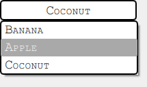
Notez que cette approche fonctionne parfaitement sur Windows et Android alors que sur OSX le code est complètement ignoré . Vous pouvez consulter le fichier de style qml dans l’installation de Qt (recherchez un sous-chemin tel que qml/QtQuick/Controls/Styles/Desktop) pour voir les modifications apportées à w.r.t. Windows et essayez d’adapter la solution fournie. Cette partie est laissée au lecteur.
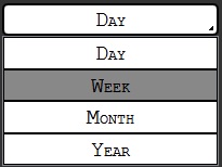
Merci beaucoup! J'ai résolu ceci par le code suivant:
Item {
id: app
width: 200
height: 150

ListModel{
    id: dataModel
    ListElement{ name: "Day" }
    ListElement{ name: "Week" }
    ListElement{ name: "Month" }
    ListElement{ name: "Year" }
}

Button {
    id: comboButton
    width: parent.width
    height: parent.height / 5
    checkable: true

    style: ButtonStyle {
       background: Rectangle {
           color: control.pressed ? "#888" : "#fff"
           smooth: true
           radius: 5
           border.width: 2

           Image {
               source: "pics/corner.png"
               anchors.bottom: parent.bottom
               anchors.right: parent.right
               anchors.bottomMargin: 5
               anchors.rightMargin: 5
           }
       }
       label: Text {
            renderType: Text.NativeRendering
            verticalAlignment: Text.AlignVCenter
            horizontalAlignment: Text.AlignHCenter
            font.family: "Courier"
            font.capitalization: Font.SmallCaps
            font.pointSize: 15
            color: "black"
            text: "Day"
        }
    }
    onVisibleChanged: {
        if(!visible)
            checked = false
    }
}

TableView {
    id: tableView
    height: 120
    width: parent.width
    anchors.bottom: parent.bottom
    highlightOnFocus: true
    headerVisible: false
    visible: comboButton.checked ? true : false

    TableViewColumn {
        role: "name"
    }
    model: dataModel

    itemDelegate: Item {
        Rectangle {
            color: styleData.selected  ? "#888" : "#fff"
            height: comboButton.height - 0.5
            border.width: 0.5
            width: parent.width

            Text {
                renderType: Text.NativeRendering
                anchors.verticalCenter: parent.verticalCenter
                anchors.horizontalCenter: parent.horizontalCenter
                font.family: "Courier"
                font.capitalization: Font.SmallCaps
                font.pointSize: 15
                color: "black"
                elide: styleData.elideMode
                text: styleData.value
            }
        }
    }

    rowDelegate: Item {
        height: comboButton.height - 0.5
    }

    onClicked: {
       comboButton.checked = false
       tableView.selection.clear()
    }
}
}
J'ai utilisé de telles approches, mais elles ont beaucoup de limitations avec la gestion focus et la gestion z-index.
J'ai fini avec l'implémentation de ComboBox qui se compose de 2 parties: un en-tête que vous mettez réellement quelque part et un composant déroulant que vous créez de manière dynamique. Ce dernier consiste en une Item couvrant tout (et en interceptant l'activité de la souris) et en une liste déroulante soigneusement positionnée sous l'en-tête.
Le code est assez lourd à inclure ici afin que vous puissiez voir les détails dans mon blog avec tout le code