Boucle d'animation CSS simple - Fading In & Out "Chargement" du texte
Sans Javascript, j'aimerais créer une classe d'animation CSS en boucle simple qui permet d'afficher et de masquer le texte à l'infini. Je ne connais pas beaucoup les animations CSS, donc je ne l'ai pas encore compris, mais voici à quel point j'en suis arrivé:
@keyframes flickerAnimation { /* flame pulses */
  0%   { opacity:1; }
  50%  { opacity:0; }
  100% { opacity:1; }
}
.animate-flicker {
    opacity:1;
    animation: flickerAnimation 1s infinite;
}
Comme King King l’a dit, vous devez ajouter le préfixe spécifique au navigateur. Cela devrait couvrir la plupart des navigateurs:
@keyframes flickerAnimation {
  0%   { opacity:1; }
  50%  { opacity:0; }
  100% { opacity:1; }
}
@-o-keyframes flickerAnimation{
  0%   { opacity:1; }
  50%  { opacity:0; }
  100% { opacity:1; }
}
@-moz-keyframes flickerAnimation{
  0%   { opacity:1; }
  50%  { opacity:0; }
  100% { opacity:1; }
}
@-webkit-keyframes flickerAnimation{
  0%   { opacity:1; }
  50%  { opacity:0; }
  100% { opacity:1; }
}
.animate-flicker {
   -webkit-animation: flickerAnimation 1s infinite;
   -moz-animation: flickerAnimation 1s infinite;
   -o-animation: flickerAnimation 1s infinite;
    animation: flickerAnimation 1s infinite;
}
<div class="animate-flicker">Loading...</div>cherchant une variante plus simple, j’ai trouvé ceci:
c'est vraiment intelligent, et je suppose que vous voudrez peut-être ajouter d'autres variantes de navigateurs, bien que cela ait fonctionné pour moi à la fois sur Chrome et Firefox.
démo et crédit => http://codepen.io/Ahrengot/pen/bKdLC
@keyframes fadeIn {
  from { opacity: 0; }
}

.animate-flicker {
    animation: fadeIn 1s infinite alternate;
}
<h2 class="animate-flicker">Jump in the hole!</h2>Pour que plusieurs éléments apparaissent en fondu enchaîné de manière séquentielle, par exemple 5 éléments disparaissent tous les 4 secondes,
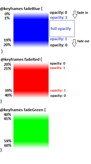
1- Créer une animation unique pour chaque élément avec animation-duration égal à [ 4s (durée pour chaque élément) * 5 (nombre d'éléments)] = 20s
animation-name: anim1 , anim2, anim3 ...
animation-duration : 20s, 20s, 20s ...
2- Obtenir une image clé d'animation pour chaque élément.
100% (keyframes percentage) / 5 (elements) = 20% (frame for each element)
3- définir les points de départ et d'arrivée pour chaque animation:
chaque animation a 20% de longueur d'image et @ pourcentage d'images clés commence toujours à 0% , de sorte que la première animation commence à 0% et se termine dans son image (20 %), et chaque animation suivante commence à partir du point de fin de l'animation précédente et se termine lorsqu'elle atteint son cadre (+ 20%),
@keyframes animation1 { 0% {}, 20% {}}
@keyframes animation2 { 20% {}, 40% {}}
@keyframes animation3 { 40% {}, 60% {}}
and so on
maintenant, nous devons faire en sorte que chaque animation passe en fondu de 0 à 1 opacité et en fondu de 1 à 0,
nous allons donc ajouter 2 autres points (étapes) pour chaque animation après le début et avant le point final pour gérer l'opacité complète (1)
http://codepen.io/El-Oz/pen/WwPPZQ
.slide1 {
    animation: fadeInOut1 24s ease reverse forwards infinite
}

.slide2 {
    animation: fadeInOut2 24s ease reverse forwards infinite
}

.slide3 {
    animation: fadeInOut3 24s ease reverse forwards infinite
}

.slide4 {
    animation: fadeInOut4 24s ease reverse forwards infinite
}

.slide5 {
    animation: fadeInOut5 24s ease reverse forwards infinite
}

.slide6 {
    animation: fadeInOut6 24s ease reverse forwards infinite
}

@keyframes fadeInOut1 {
    0% { opacity: 0 }
    1% { opacity: 1 }
    14% {opacity: 1 }
    16% { opacity: 0 }
}

@keyframes fadeInOut2 {
    0% { opacity: 0 }
    14% {opacity: 0 }
    16% { opacity: 1 }
    30% { opacity: 1 }
    33% { opacity: 0 }
}

@keyframes fadeInOut3 {
    0% { opacity: 0 }
    30% {opacity: 0 }
    33% {opacity: 1 }
    46% { opacity: 1 }
    48% { opacity: 0 }
}

@keyframes fadeInOut4 {
    0% { opacity: 0 }
    46% { opacity: 0 }
    48% { opacity: 1 }
    64% { opacity: 1 }
    65% { opacity: 0 }
}

@keyframes fadeInOut5 {
    0% { opacity: 0 }
    64% { opacity: 0 }
    66% { opacity: 1 }
    80% { opacity: 1 }
    83% { opacity: 0 }
}

@keyframes fadeInOut6 {
    80% { opacity: 0 }
    83% { opacity: 1 }
    99% { opacity: 1 }
    100% { opacity: 0 }
}
http://www.w3schools.com/cssref/css3_pr_animation-keyframes.asp
c'est en fait un problème de navigateur ... utilisez -webkit- pour chrome