Comment faire une flèche de fantaisie en utilisant CSS?
Ok, alors tout le monde sait que vous pouvez faire un triangle en utilisant ceci:
#triangle {
    width: 0;
    height: 0;
    border-left: 50px solid transparent;
    border-right: 50px solid transparent;
    border-bottom: 100px solid red;
}
Et cela produit un triangle plein et plein. Mais comment feriez-vous un triangle en forme de flèche, de type creux?
Vous pouvez utiliser le pseudo-élément before ou after et lui appliquer des CSS. Il y a plusieurs façons. Vous pouvez ajouter before et after, faire pivoter et positionner chacune d’elles pour former l’une des barres. Une solution plus simple consiste à ajouter deux bordures à l'élément before et à les faire pivoter à l'aide de transform: rotate.
Faites défiler vers le bas pour une solution différente qui utilise un élément réel au lieu des pseudo-éléments
Dans ce cas, j'ai ajouté les flèches sous forme de puces dans une liste et utilisé em tailles pour les redimensionner correctement avec la police de la liste.
ul {
    list-style: none;
}

ul.big {
    list-style: none;
    font-size: 300%
}

li::before {
    position: relative;
    /* top: 3pt; Uncomment this to lower the icons as requested in comments*/
    content: "";
    display: inline-block;
    /* By using an em scale, the arrows will size with the font */
    width: 0.4em;
    height: 0.4em;
    border-right: 0.2em solid black;
    border-top: 0.2em solid black;
    transform: rotate(45deg);
    margin-right: 0.5em;
}

/* Change color */
li:hover {
  color: red; /* For the text */
}
li:hover::before {
  border-color: red; /* For the arrow (which is a border) */
}
<ul>
<li>Item1</li>
<li>Item2</li>
<li>Item3</li>
<li>Item4</li>
</ul>
<ul class="big">
<li>Item1</li>
<li>Item2</li>
<li>Item3</li>
<li>Item4</li>
</ul>Bien sûr, vous n'avez pas besoin d'utiliser before ou after, vous pouvez également appliquer la même astuce à un élément normal. Pour la liste ci-dessus, c'est pratique, car vous n'avez pas besoin de balisage supplémentaire. Mais parfois, vous pouvez (ou avez besoin) du balisage de toute façon. Vous pouvez utiliser div ou span pour cela, et j'ai même vu des gens recycler même l'élément i pour les "icônes". Donc, cette balise pourrait ressembler à celle ci-dessous. La question de savoir si <i> est correct est discutable, mais vous pouvez également utiliser span pour être sûr.
/* Default icon formatting */
i {
  display: inline-block;
  font-style: normal;
  position: relative;
}

/* Additional formatting for arrow icon */
i.arrow {
    /* top: 2pt; Uncomment this to lower the icons as requested in comments*/
    width: 0.4em;
    height: 0.4em;
    border-right: 0.2em solid black;
    border-top: 0.2em solid black;
    transform: rotate(45deg);
}
And so you can have an <i class="arrow" title="arrow icon"></i> in your text.
This arrow is <i class="arrow" title="arrow icon"></i> used to be deliberately lowered slightly on request.
I removed that for the general public <i class="arrow" title="arrow icon"></i> but you can uncomment the line with 'top' <i class="arrow" title="arrow icon"></i> to restore that effect.Si vous recherchez plus d’inspiration, ne manquez pas cette incroyable bibliothèque d’icônes CSS pur de Nicolas Gallagher . :)
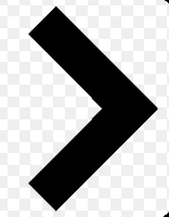
Cela peut être résolu beaucoup plus facilement que les autres suggestions.
Il vous suffit de dessiner un carré et d’appliquer une propriété border à seulement 2 côtés de jonction.
Puis faites pivoter le carré en fonction de la direction dans laquelle vous souhaitez que la flèche pointe, par exemple: transform: rotate(<your degree here>)
.triangle {
    border-right: 10px solid;
    border-bottom: 10px solid;
    height: 30px;
    width: 30px;
    transform: rotate(-45deg);
}
<div class="triangle"></div>Flèches réactives
ils redimensionnent automatiquement avec votre text et sont colorés de la même couleur. Plug and play :)
jsBin terrain de démonstration
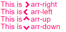
body{
  font-size: 25px; /* Change font and  see the magic! */
  color: #f07;     /* Change color and see the magic! */
}

/* RESPONSIVE ARROWS */
[class^=arr-]{
  border:       solid currentColor;
  border-width: 0 .2em .2em 0;
  display:      inline-block;
  padding:      .20em;
}
.arr-right {transform:rotate(-45deg);  -webkit-transform:rotate(-45deg);}
.arr-left  {transform:rotate(135deg);  -webkit-transform:rotate(135deg);}
.arr-up    {transform:rotate(-135deg); -webkit-transform:rotate(-135deg);}
.arr-down  {transform:rotate(45deg);   -webkit-transform:rotate(45deg);}
This is <i class="arr-right"></i> .arr-right<br>
This is <i class="arr-left"></i> .arr-left<br>
This is <i class="arr-up"></i> .arr-up<br>
This is <i class="arr-down"></i> .arr-downVoici une approche différente:
1) Utilisez le caractère de multiplication: × × ×
2) Cachez la moitié avec overflow:hidden
3) Ajoutez ensuite un triangle en tant que pseudo-élément pour la pointe.
L'avantage ici est qu'aucune transformation n'est nécessaire. (Cela fonctionnera dans IE8 +)
.arrow {
  position: relative;
}
.arrow:before {
  content: '×';
  display: inline-block;
  position: absolute;
  font-size: 240px;
  font-weight: bold;
  font-family: verdana;
  width: 103px;
  height: 151px;
  overflow: hidden;
  line-height: 117px;
}
.arrow:after {
  content: '';
  display: inline-block;
  position: absolute;
  left: 101px;
  top: 51px;
  width: 0;
  height: 0;
  border-style: solid;
  border-width: 25px 0 25px 24px;
  border-color: transparent transparent transparent black;
}
<div class="arrow"></div>Il suffit d'utiliser avant et aprèsPseudo-éléments - CSS
*{box-sizing: border-box; padding: 0; margin: 0}
:root{background: white; transition: background .3s ease-in-out}
:root:hover{background: red }
div{
  margin: 20px auto;
  width: 150px;
  height: 150px;
  position:relative
}

div:before, div:after{
  content: '';
  position: absolute;
  width: 75px;
  height: 20px;
  background: black;
  left: 40px
}

div:before{
  top: 45px;
  transform: rotateZ(45deg)
}

div:after{
  bottom: 45px;
  transform: rotateZ(-45deg)
}<div/>Une autre approche utilisant border et no CSS3 propriétés:
div, div:after{
    border-width: 80px 0 80px 80px;
    border-color: transparent transparent transparent #000;
    border-style:solid;
    position:relative;
}
div:after{
    content:'';
    position:absolute;
    left:-115px; top:-80px;
    border-left-color:#fff;
}<div></div>> lui-même est une flèche très merveilleuse! Prévoyez simplement une div avec elle et coiffez-la.
div{
  font-size:50px;
}
div::before{
  content:">";
  font: 50px 'Consolas';
  font-weight:900;
}
<div class="arrowed">Hatz!</div>Flèche gauche/droite avec effet de survol en utilisant le tour de box-shadow de Roko C. Buljan
.arr {
  display: inline-block;
  padding: 1.2em;
  box-shadow: 8px 8px 0 2px #777 inset;
}
.arr.left {
  transform: rotate(-45deg);
}
.arr.right {
  transform: rotate(135deg);
}
.arr:hover {
  box-shadow: 8px 8px 0 2px #000 inset
}
<div class="arr left"></div>
<div class="arr right"></div>Je devais changer une input en une flèche dans mon projet. Ci-dessous, le travail final.
#in_submit {
  background-color: white;
  border-left: #B4C8E9;
  border-top: #B4C8E9;
  border-right: 3px solid black;
  border-bottom: 3px solid black;
  width: 15px;
  height: 15px;
  transform: rotate(-45deg);
  margin-top: 4px;
  margin-left: 4px;
  position: absolute;
  cursor: pointer;
}
<input id="in_submit" type="button" class="convert_btn">Ici Fiddle
.arrow {
  display : inline-block;
  font-size: 10px; /* adjust size */
  line-height: 1em; /* adjust vertical positioning */
  border: 3px solid #000000;
  border-left: transparent;
  border-bottom: transparent;
  width: 1em; /* use font-size to change overall size */
  height: 1em; /* use font-size to change overall size */
}

.arrow:before {
  content: "\00a0"; /* needed to hook line-height to "something" */
}

.arrow.left {
  margin-left: 0.5em;
  -webkit-transform: rotate(225deg);
  -moz-transform: rotate(225deg);
  -o-transform: rotate(225deg);
  -ms-transform: rotate(225deg);
  transform: rotate(225deg);
}

.arrow.right {
  margin-right: 0.5em;
  -webkit-transform: rotate(45deg);
  -moz-transform: rotate(45deg);
  -o-transform: rotate(45deg);
  -ms-transform: rotate(45deg);
  transform: rotate(45deg);
}

.arrow.top {
  line-height: 0.5em; /* use this to adjust vertical positioning */
  margin-left: 0.5em;
  margin-right: 0.5em;
  -webkit-transform: rotate(-45deg);
  -moz-transform: rotate(-45deg);
  -o-transform: rotate(-45deg);
  -ms-transform: rotate(-45deg);
  transform: rotate(-45deg);
}

.arrow.bottom {
  line-height: 2em;
  /* use this to adjust vertical positioning */
  margin-left: 0.5em;
  margin-right: 0.5em;
  -webkit-transform: rotate(135deg);
  -moz-transform: rotate(135deg);
  -o-transform: rotate(135deg);
  -ms-transform: rotate(135deg);
  transform: rotate(135deg);
}
<div>
here are some arrows
<div class='arrow left'></div> space
<div class='arrow right'></div> space
<div class='arrow top'></div> space
<div class='arrow bottom'></div> space with proper spacing?
</div>Semblable à Roko C, mais un peu plus de contrôle sur la taille et le placement.