Comment puis-je créer une flèche ronde avec uniquement HTML et CSS?
J'essaie de créer une flèche directionnelle ronde avec CSS et HTML. Voici mes tentatives.
Tentative 1
En cela, j'ai tourné le <div> et une flèche, mais les deux sont dans des positions différentes.
Voici le CSS:
 #curves div {
   width: 100px;
   height: 100px;
   border: 5px solid #999;
 }
 #curves.width div {
   border-color: transparent transparent transparent #999;
 }
 #curve1 {
   -moz-border-radius: 50px 0 0 50px;
   border-radius: 50px 0 0 50px;
 }
 .arrow-right {
   width: 0;
   height: 0;
   border-top: 10px solid transparent;
   border-bottom: 10px solid transparent;
   border-left: 27px solid #ccc;
   float: right;
   margin-top: -7px;
   margin-right: -26px;
 }
<div id="curves" class="width">
<div id="curve1"></div><span class="arrow-right"></span>
</div>Tentative 2
En cela, la flèche que j'ai créée est droite.
.container {
  width: 60%;
  height: 9px;
  background: #ccc;
  margin: 100px auto;
  -moz-border-radius: 50px 0 0 50px;
  border-radius: 50px 0 0 50px;
}
.arrow-right {
  width: 0;
  height: 0;
  border-top: 10px solid transparent;
  border-bottom: 10px solid transparent;
  border-left: 27px solid #ccc;
  float: right;
  margin-top: -7px;
  margin-right: -26px;
}
<div class="container">
</span><span class="arrow-right"></span>
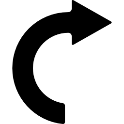
</div>Mise à jour Je le veux quelque chose comme ça
Vous pouvez utiliser un pseudo-élément pour générer le triangle (en utilisant le fameux hack de bordure).
Après cela, vous pourrez utiliser une bordure épaisse sur l'élément réel (avec un border-radius de 50% pour en faire un cercle). Cela vous permet de faire pivoter la flèche à votre guise.
div {
  border: 20px solid transparent;
  border-top-color: black;
  border-left-color: black;
  height: 100px;
  width: 100px;
  border-radius: 50%;
  position: relative;
  -webkit-transform: rotate(-45deg);
  -ms-transform: rotate(-45deg);
  transform: rotate(-45deg);
  margin:30px auto;
}
div:before {
  content: "";
  position: absolute;
  top: -20px;
  left: 80%;
  height: 0;
  width: 0;
  border-left: 30px solid black;
  border-top: 30px solid transparent;
  border-bottom: 30px solid transparent;
  -webkit-transform: rotate(45deg);
  -ms-transform: rotate(45deg);
  transform: rotate(45deg);
}


/*BELOW IS FOR DEMO ONLY*/

div:hover {
  -webkit-transform: rotate(315deg);
  -ms-transform: rotate(315deg);
  transform: rotate(315deg);
  transition: all 0.8s;
}
html {
  text-align:center;
  color:white;
  font-size:30px;
  height: 100%;
  background: rgb(79, 79, 79);
  /* Old browsers */
  background: -moz-radial-gradient(center, ellipse cover, rgba(79, 79, 79, 1) 0%, rgba(34, 34, 34, 1) 100%);
  /* FF3.6+ */
  background: -webkit-gradient(radial, center center, 0px, center center, 100%, color-stop(0%, rgba(79, 79, 79, 1)), color-stop(100%, rgba(34, 34, 34, 1)));
  /* Chrome,Safari4+ */
  background: -webkit-radial-gradient(center, ellipse cover, rgba(79, 79, 79, 1) 0%, rgba(34, 34, 34, 1) 100%);
  /* Chrome10+,Safari5.1+ */
  background: -o-radial-gradient(center, ellipse cover, rgba(79, 79, 79, 1) 0%, rgba(34, 34, 34, 1) 100%);
  /* Opera 12+ */
  background: -ms-radial-gradient(center, ellipse cover, rgba(79, 79, 79, 1) 0%, rgba(34, 34, 34, 1) 100%);
  /* IE10+ */
  background: radial-gradient(ellipse at center, rgba(79, 79, 79, 1) 0%, rgba(34, 34, 34, 1) 100%);
  /* W3C */
  filter: progid: DXImageTransform.Microsoft.gradient(startColorstr='#4f4f4f', endColorstr='#222222', GradientType=1);
  /* IE6-9 fallback on horizontal gradient */
}
HOVER ME
<div></div>Si vous souhaitez ensuite allonger la flèche, vous pouvez rendre la bordure inférieure visible. Par exemple;
div {
  border: 20px solid transparent;
  border-top-color: black;
  border-left-color: black;
  border-bottom-color: black;
  height: 100px;
  width: 100px;
  border-radius: 50%;
  position: relative;
  transform: rotate(-45deg);
  margin:30px auto;
}
div:before {
  content: "";
  position: absolute;
  top: -20px;
  left: 80%;
  height: 0;
  width: 0;
  border-left: 30px solid black;
  border-top: 30px solid transparent;
  border-bottom: 30px solid transparent;
  transform: rotate(45deg);
}


/*BELOW IS FOR DEMO ONLY*/

div:hover {
  transform: rotate(315deg);
  transition: all 0.8s;
}
html {
  text-align:center;
  color:white;
  font-size:30px;
  height: 100%;
  background: rgb(79, 79, 79);
  /* Old browsers */
  background: -moz-radial-gradient(center, ellipse cover, rgba(79, 79, 79, 1) 0%, rgba(34, 34, 34, 1) 100%);
  /* FF3.6+ */
  background: -webkit-gradient(radial, center center, 0px, center center, 100%, color-stop(0%, rgba(79, 79, 79, 1)), color-stop(100%, rgba(34, 34, 34, 1)));
  /* Chrome,Safari4+ */
  background: -webkit-radial-gradient(center, ellipse cover, rgba(79, 79, 79, 1) 0%, rgba(34, 34, 34, 1) 100%);
  /* Chrome10+,Safari5.1+ */
  background: -o-radial-gradient(center, ellipse cover, rgba(79, 79, 79, 1) 0%, rgba(34, 34, 34, 1) 100%);
  /* Opera 12+ */
  background: -ms-radial-gradient(center, ellipse cover, rgba(79, 79, 79, 1) 0%, rgba(34, 34, 34, 1) 100%);
  /* IE10+ */
  background: radial-gradient(ellipse at center, rgba(79, 79, 79, 1) 0%, rgba(34, 34, 34, 1) 100%);
  /* W3C */
  filter: progid: DXImageTransform.Microsoft.gradient(startColorstr='#4f4f4f', endColorstr='#222222', GradientType=1);
  /* IE6-9 fallback on horizontal gradient */
}
HOVER ME
<div></div>Solution SVG
La forme est vraiment simple à créer en SVG.
Pour le svg intéressé:
<svg width="200px" height="200px" viewbox="0 0 400 400">
  <path stroke="#000" stroke-width="50" fill="none"
        d="M200 350 A 100 100 0 0 1 200 150
           M200 150 200 125 225 150 200 175Z"/>
</svg>J'ai créé cette petite chose en CSS, vous pouvez regarder le code pour voir comment cela fonctionne.
Remarque: cela nécessite un fond solide.
.arrow {
  width: 200px;
  height: 200px;
  border: 6px solid;
  border-radius: 50%;
  position: relative;
}
.arrow:before {
  content: "";
  display: block;
  width: 10px;
  height: 50px;
  background: #fff;
  position: absolute;
  bottom: 0;
  top: 0;
  right: -6px;
  margin: auto;
}
.arrow:after {
  content: "";
  width: 0;
  height: 0;
  border-left: 20px solid transparent;
  border-right: 20px solid transparent;
  border-top: 20px solid #000;
  position: absolute;
  bottom: 106px;
  right: -20px;
}
<div class="arrow"></div>Voici une autre façon de le faire en utilisant des chemins de clip au lieu de jouer avec les bordures.
Démo - http://jsfiddle.net/r8rd0yde/4/
.arrow {
  position: relative;
  padding: 20px;
  width: 100px;
  height: 100px;
}
.circle {
  position: absolute;
  box-sizing: border-box;
  height: 100px;
  width: 100px;
  border: 15px solid #000;
  border-radius: 50%;
  -webkit-clip-path: inset(0 50% 0 0);
  clip-path: inset(0 50% 0 0);
}
.triangle {
  position: absolute;
  width: 35px;
  height: 30px;
  background: #000;
  margin-top: -6px;
  margin-left: 38px;
  -webkit-clip-path: polygon(50% 0, 0% 100%, 100% 100%);
  clip-path: polygon(50% 0, 0% 100%, 100% 100%);
  -moz-transform: rotate(90deg);
  -webkit-transform: rotate(90deg);
  -o-transform: rotate(90deg);
  -ms-transform: rotate(90deg);
  transform: rotate(90deg);
}
/* JUST FOR DEMO */

.arrow:hover {
  -webkit-transform: rotate(720deg);
  -ms-transform: rotate(720deg);
  transform: rotate(720deg);
  transition: all 1.2s;
}
<div class="arrow">
<div class="circle"></div>
<div class="triangle"></div>
</div>Vous pouvez utiliser le caractère flèche circulaire dans le sens horaire (U + 21BB) : ↻
.arrow {
  display: inline-block;
  font-size: 300px;
  line-height: 200px;
  font-weight: bold;
  transform: rotate(90deg);
}
<span class="arrow">↻</span>#curvedarrow {
position: relative;
width: 0;
height: 0;
border-top: 9px solid transparent;
border-right: 9px solid red;
-webkit-transform: rotate(10deg);
-moz-transform: rotate(10deg);
-ms-transform: rotate(10deg);
-o-transform: rotate(10deg);
}
#curvedarrow:after {
content: "";
position: absolute;
border: 0 solid transparent;
border-top: 3px solid red;
border-radius: 20px 0 0 0;
top: -12px;
left: -9px;
width: 12px;
height: 12px;
-webkit-transform: rotate(45deg);
-moz-transform: rotate(45deg);
-ms-transform: rotate(45deg);
-o-transform: rotate(45deg);
}
J'ai trouvé cela dans https://css-tricks.com/examples/ShapesOfCSS/
Ce n'est peut-être pas la forme exacte que vous voulez, mais c'est certainement un bon point de départ.