Comment puis-je créer un carrousel d'images avec uniquement du CSS?
Je cherche à créer un carrousel d'images dans lequel un utilisateur peut basculer entre les images en cliquant sur les flèches. Par exemple:
Cependant, je ne peux utiliser que HTML et CSS - pas de JavaScript (et donc de jQuery). J'ai juste besoin de la configuration de base; des transitions douces et autres ne sont pas nécessaires.
Comment puis-je y parvenir?
C'est facile! Utilisez simplement des boutons radio et des étiquettes ciblées.
Les boutons radio ont le comportement (nécessaire) de ne permettre qu’un seul d’être sélectionné à la fois - tout comme une image dans notre carrousel.
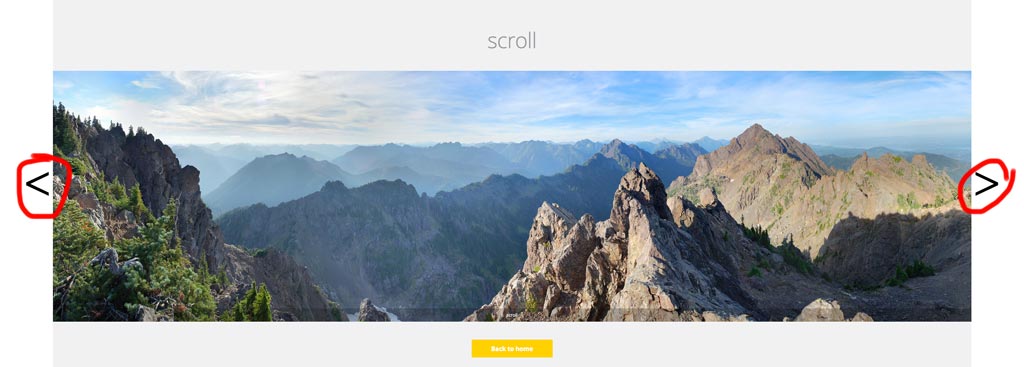
Démo
div.wrap2 {
  float: left;
  height: 500px;
  width: 422px;
}
div.group input {
  display: none;
  left: -100%;
  position: absolute;
  top: -100%;
}
div.group input ~ div.content {
  border: solid 1px black;
  display: none;
  height: 350px;
  margin: 0px 60px;
  position: relative;
  width: 300px;
}
div.group input:checked ~ div.content {
  display: block;
}
div.group input:checked ~ label.previous,
div.group input:checked ~ label.next {
  display: block;
}
div.group label {
  background-color: #69c;
  border: solid 1px black;
  display: none;
  height: 50px;
  width: 50px;
}
img {
  left: 0;
  margin: 0 auto;
  position: absolute;
  right: 0;
}
p {
  text-align: center;
}
label {
  font-size: 4em;
  margin: 125px 0 0 0;
}
label.previous {
  float: left;
  padding: 0 0 30px 5px;
}
label.next {
  float: right;
  padding: 0 5px 25px 0;
  text-align: right;
}
<div class="wrap">
<div class="wrap2">
<div class="group">
<input type="radio" name="test" id="0" value="0">
<label for="4" class="previous"><</label>
<label for="1" class="next">></label>
<div class="content">
<p>panel #0</p>
<img src="http://i.stack.imgur.com/R5yzx.jpg" width="200" height="286">
</div>
</div>
<div class="group">
<input type="radio" name="test" id="1" value="1">
<label for="0" class="previous"><</label>
<label for="2" class="next">></label>
<div class="content">
<p>panel #1</p>
<img src="http://i.stack.imgur.com/k0Hsd.jpg" width="200" height="139">
</div>
</div>
<div class="group">
<input type="radio" name="test" id="2" value="2">
<label for="1" class="previous"><</label>
<label for="3" class="next">></label>
<div class="content">
<p>panel #2</p>
<img src="http://i.stack.imgur.com/Hhl9H.jpg" width="140" height="200">
</div>
</div>
<div class="group">
<input type="radio" name="test" id="3" value="3" checked="">
<label for="2" class="previous"><</label>
<label for="4" class="next">></label>
<div class="content">
<p>panel #3</p>
<img src="http://i.stack.imgur.com/r1AyN.jpg" width="200" height="287">
</div>
</div>
<div class="group">
<input type="radio" name="test" id="4" value="4">
<label for="3" class="previous"><</label>
<label for="0" class="next">></label>
<div class="content">
<p>panel #4</p>
<img src="http://i.stack.imgur.com/EHHsa.jpg" width="96" height="139">
</div>
</div>
</div>
</div>TLDR: Notes importantes
- Assurez-vous qu'au moins un
input(type="radio")soitcheckedpar défaut, sinon le carrousel sera masqué. - Masquer les radios d'entrée et utiliser des étiquettes comme boutons précédent/suivant
- Assurez-vous que le
labelscible correctement l'entrée radio précédente/suivante (voir la section à la fin du libellé pour savoir comment faire le ciblage). - Afficher une image lorsque la radio d'entrée correspondante est
:checked - Utilisez de jolies images de chaton
Explication
Voici à quoi devrait ressembler la structure HTML de base:
div#holder
    div.group
        input(type="radio")
        label.previous
        label.next
        div.content
            img
    div.group
        // ... repeat as necessary
div#holder Tiendra tout notre contenu en place. Ensuite, nous regrouperons nos boutons radio, étiquettes et images sous un div.group. Cela garantit que nos entrées radio ne souffrent pas d'interférences destructives (jeu de mots).
La clé est dans les sélecteurs (et les étiquettes - assurez-vous de lire cette section)
Premièrement, nous allons masquer nos boutons radio - ils sont moches quand même:
div.group input {
    display: none;
    position: absolute;
    top: -100%;
    left: -100%;
}
Nous n'aurons jamais à cliquer sur les boutons radio. Au lieu de cela, nous allons styliser nos étiquettes et ajouter des cibles (propriétés for), afin qu'elles redirigent le clic vers le bloc d'entrée radio approprié.
La plupart de nos étiquettes devraient être cachées:
div.group label {
    display: none;
}
(Je vais omettre tout style esthétique, afin de rendre le style plus facile à comprendre. Vous pouvez voir la meilleure version dans l'extrait de pile.)
Sauf pour ceux situés à côté d'une entrée radio activée, ou :checked
div.group input:checked ~ label.previous,
div.group input:checked ~ label.next {
    display: block;
}
De plus, le div.content Suivant une entrée cochée devrait également être affiché:
div.group input:checked ~ div.content {
    display: block;
}
Cependant, lorsque le bouton radio n'est pas coché, div.content Doit être masqué:
div.group input ~ div.content {
    display: none;
    position: relative;
}
Bazinga! Maintenant, notre carrousel devrait être pleinement principalement fonctionnel, quoique un peu moche. Déplaçons nos étiquettes à la bonne position:
label.previous { float: left; }
label.next { float: right; }
Et centrez nos images dans leurs divisions respectives:
img {
    left: 0;
    margin: 0 auto;
    position: absolute;
    right: 0;
}
La dernière étape concerne la configuration de vos étiquettes:
<input type="radio" id="1">
<label class="previous" for="0"><</label>
<label class="next" for="2">></label>
Notez comment, étant donné une entrée radio avec un id de n, le label.previous Aura un attribut for de (n - 1) % M Et le label.next Aura un attribut for de (n + 1) % M, Où M est le nombre d'images du carrousel.
Supplémentaire
Si vous utilisez Jade (ou un autre moteur de template), vous pouvez le configurer avec une simple boucle for comme ceci:
div.wrap2
- var imgs = [[200, 286], [200, 139], [140, 200], [200, 287], [96, 139]];
- for (var i = 0; i < imgs.length; i++)
div.group
input(type="radio" name="test" id="#{i}" value="#{i}" checked="#{input == 3}")
label(for="#{(i - 1 + imgs.length) % imgs.length}").previous <
label(for="#{(i + 1) % imgs.length}").next >
div.content
p panel ##{i}
img(src="http://placekitten.com/g/#{imgs[i].join('/')}"
height="#{imgs[i][1]}"
width="#{imgs[i][0]}"
)
Notez que css ci-dessous ne répond pas à l'exigence spécifique à la question
où un utilisateur peut basculer entre les images, en cliquant sur les flèches.
Utilise :targetpseudo classe , les vignettes sont des commandes permettant de basculer entre les images; modélisé sur le modèle décrit à l'étape Comment déclencher des transitions CSS3 sur Click en utilisant: target
body {
  width: 70%;
  overflow: hidden;
}

section {
  position: relative;
  display: block;
  left: calc(50%);
}
/* set `div` container `background` to last `div img` `src` */
div {
  display: inline-block;
  position: relative;
  height: 100px;
  width: 100px;
  background: url(http://lorempixel.com/100/100/cats);
  border: 0.1em outset black;
}
/* set `img` `opacity:0`  */
div img {
  position: absolute;
  transition: all 500ms ease-in-out;
  -moz-transition: all 500ms ease-in-out;
  -webkit-transition: all 500ms ease-in-out;
  -o-transition: all 500ms ease-in-out;
  -ms-transition: all 500ms ease-in-out;
  opacity: 0;
}
/*
   display `:target` `img` on click of `a`,
   having `img` as fragment identifier
*/
div img:target {
  opacity: 1;
  animation: active 1s ease-in-out 0s normal 1 both;
  -moz-animation: active 1s ease-in-out 0s normal 1 both;
  -webkit-animation: active 1s ease-in-out 0s normal 1 both;
}
/* `.thumbs` `span` elements */
.thumbs {
  height: 25px;
  width: 25px;
  padding: 1px;
  display: inline-block;
  position: relative;
  text-align: center;
  border: 0.1em inset black;
  border-radius: 50px;
  font-size: 1em;
}
/* set `background` of `.thumbs` `span` elements  */
[href="#3"] .thumbs {
  background: url(http://lorempixel.com/100/100/cats);
  background-size: 100%;
  background-repeat: no-repeat;
}

[href="#2"] .thumbs {
  background: url(http://lorempixel.com/100/100/animals);
  background-size: 100%;
  background-repeat: no-repeat;
}

[href="#1"] .thumbs {
  background: url(http://lorempixel.com/100/100/technics);
  background-size: 100%;
  background-repeat: no-repeat;
}

[href="#0"] .thumbs {
  background: url(http://lorempixel.com/100/100/nature);
  background-size: 100%;
  background-repeat: no-repeat;
}

span:hover {
  border-top: 0.1em solid gold;
  border-left: 0.1em solid yellow;
  border-bottom: 0.1em solid orange;
  border-right: 0.1em solid goldenrod;
  box-shadow: 0 0 0 0.125em sienna, 0 0 0 0.225em dodgerblue;
}

a {
  top: 30%;
  text-decoration: none;
  display: inline-block;
  position: relative;
  color: transparent;
}

nav a {
  left: -16px;
}

@keyframes active {
  0% {
    box-shadow: 0 0 0 0.125em dodgerblue, 0 0 0 0.25em yellow;
  }
  100% {
    box-shadow: none;
  }
}

@-webkit-keyframes active {
  0% {
    box-shadow: 0 0 0 0.125em dodgerblue, 0 0 0 0.25em yellow;
  }
  100% {
    box-shadow: none;
  }
}

@-moz-keyframes active {
  0% {
    box-shadow: 0 0 0 0.125em dodgerblue, 0 0 0 0.25em yellow;
  }
  100% {
    box-shadow: none;
  }
}
<section>
<div>
<img src="http://lorempixel.com/100/100/nature" id="0" />
<img src="http://lorempixel.com/100/100/technics" id="1" />
<img src="http://lorempixel.com/100/100/animals" id="2" />
<img src="http://lorempixel.com/100/100/cats" id="3" />
</div>
<nav>
<a href="#3">
<span class="thumbs">
</span>
</a>
<a href="#2">
<span class="thumbs">
</span>
</a>
<a href="#1">
<span class="thumbs">
</span>
</a>
<a href="#0">
<span class="thumbs">
</span>
</a>
</nav>
</section>Inspiré par royhowie, je me suis retrouvé avec une solution beaucoup plus simple s’agissant de la syntaxe HTML. En outre, avec une belle animation et entièrement personnalisable!
L'idée principale était de créer les flèches non pas en les plaçant un par un dans HTML, mais en créant puis en positionnant soigneusement des pseudo-éléments.
* {
    -ms-box-sizing: border-box;
    -moz-box-sizing: border-box;
    -webkit-box-sizing: border-box;
    box-sizing: border-box;
}

.CSS_slideshow {
    display: block;
    width: 600px;
    height: 425px;
    overflow: hidden;
    margin: 0 auto;
    -ms-user-select: none;
    -moz-user-select: none;
    -webkit-user-select: none;
    user-select: none;
    text-space-collapse: trim-inner;
}
.CSS_slideshow[data-show-indicators="true"][data-indicators-position="in"] {
    -webkit-margin-after: -25px; /* Removes the space under the slideshow. Webkit only as only Webkit-based browsers will support the dots in the wrapper */
}
/* Defines animation timing function */
.CSS_slideshow[data-animation-style] {
    -moz-transition-timing-function: ease-in-out;
    -webkit-transition-timing-function: ease-in-out;
    transition-timing-function: ease-in-out;
}
    /* Inherit all animation properties from parent element */
    .CSS_slideshow[data-animation-style] *,
    .CSS_slideshow[data-show-buttons="true"][data-animation-style] label:before,
    .CSS_slideshow[data-show-buttons="true"][data-animation-style] label:after {
        -moz-transition-duration: inherit;
        -webkit-transition-duration: inherit;
        transition-duration: inherit;
        -moz-transition-timing-function: inherit;
        -webkit-transition-timing-function: inherit;
        transition-timing-function: inherit;
    }
    /* WRAPPER */
    .CSS_slideshow_wrapper {
        display: block;
        width: 600px;
        height: 400px;
        position: relative;
        /* Styling */
        text-align: center;
    }
        /* Indicators */
        .CSS_slideshow[data-show-indicators="true"] input {
            width: 10px;
            height: 10px;
            outline: none;
            position: relative;
            top: calc(100% + 7px);
            -ms-transform: scale(1); /* Fallback for Internet Explorer: supports radio button resizing, does not support :after. Not necessary, put for readibility. */
            -moz-transform: scale(0.6); /* Fallback for Firefox: does not radio button resizing, does not support :after */
            -webkit-appearance: none; /* hide radio buttons for Webkit: supports :after */
        }
        .CSS_slideshow[data-show-indicators="true"] input:checked {
            -ms-transform: scale(1.25); /* Fallback for Internet Explorer: supports radio button resizing, does not support :after */
            -moz-transform: scale(0.9); /* Fallback for Firefox: it does not do radio button resizing, does not support :after */
        }
        /* Webkit-only goodness - for now */
        .CSS_slideshow[data-show-indicators="true"] input:after {
            content: '';
            display: block;
            position: absolute;
            left: 0;
            width: 8px;
            height: 8px;
            border: 1px solid;
            border-radius: 100%;
            cursor: pointer;
            z-index: 4;
            -moz-transition-property: transform, background;
            -webkit-transition-property: transform, background;
            transition-property: transform, background;
        }
        .CSS_slideshow[data-show-indicators="true"][data-indicators-position="under"] input:after {
            top: -2px;
            background: rgba(0, 0, 0, 0);
            border-color: rgb(0, 0, 0);
        }
        .CSS_slideshow[data-show-indicators="true"][data-indicators-position="in"] input:after {
            top: -35px;
            box-shadow: inset 0 0 2px rgba(0, 0, 0, 0.25), 0 0 2px rgba(0, 0, 0, 0.25);
            background: rgba(235, 235, 235, 0);
            border-color: rgb(235, 235, 235);
        }
        .CSS_slideshow[data-show-indicators="true"] input:checked:after {
            -webkit-transform: scale(1.25);
        }
        .CSS_slideshow[data-show-indicators="true"][data-indicators-position="under"] input:checked:after {
            background: rgb(0, 0, 0)
        }
        .CSS_slideshow[data-show-indicators="true"][data-indicators-position="in"] input:checked:after {
            box-shadow: 0 0 2px rgba(0, 0, 0, 0.25);
            background: rgb(235, 235, 235);
        }
        .CSS_slideshow:not([data-show-indicators="true"]) input {
            display: none;
        }
        /* SLIDES */
        .CSS_slideshow label {
            display: inline-block;
            width: 100%;
            height: 100%;
            position: absolute;
            top: 0;
        }
        .CSS_slideshow[data-animation-style="slide"] label {
            -moz-transition-property: left;
            -webkit-transition-property: left;
            transition-property: left;
        }
        .CSS_slideshow label img {
            width: 100%;
            height: 100%;
        }
        /* Puts all the slides on the left... */
        .CSS_slideshow label {
            left: -100%;
        }
        /* ...except the ones coming after input:checked - those are put on the right... */
        .CSS_slideshow input:checked ~ label {
            left: 100%;
        }
        /* ...except the one coming directly after input:checked - this is our current slide and it's in the middle */
        .CSS_slideshow input:checked + label {
            left: 0;
        }
            /* PREV/NEXT ARROWS */
            .CSS_slideshow[data-show-buttons="true"] label:before,
            .CSS_slideshow[data-show-buttons="true"] label:after {
                display: block;
                position: absolute;
                width: 60px;
                height: 60px;
                top: calc((100% - 60px) / 2);
                /* Styling */
                background: rgb(235, 235, 235);
                font-size: 35px;
                font-weight: 800;
                font-family: Consolas;
                line-height: 56px;
                color: black;
                z-index: 1;
                cursor: pointer;
            }
            .CSS_slideshow[data-show-buttons="true"][data-animation-style="slide"] label:before,
            .CSS_slideshow[data-show-buttons="true"][data-animation-style="slide"] label:after {
                -moz-transition-property: left, right;
                -webkit-transition-property: left, right;
                transition-property: left, right;
            }
            .CSS_slideshow[data-show-buttons="true"] label:hover:before,
            .CSS_slideshow[data-show-buttons="true"] label:hover:after {
                /* Styling */
                background: rgb(245, 245, 245);
            }
            /* Slides on the left */
            /* Since the slides are on the left, we need to move the buttons 100% to the right */
            .CSS_slideshow[data-show-buttons="true"] label:before {
                right: -100%;
                opacity: 0;
                /* Styling */
                content: '>'; /* next */
            }
            .CSS_slideshow[data-show-buttons="true"] label:after {
                left: 100%;
                opacity: 1;
                /* Styling */
                content: '<'; /* previous */
            }
            /* Slides on the right */
            /* Since the slides are on the right, we need to move the buttons 100% to the left */
            .CSS_slideshow[data-show-buttons="true"] input:checked ~ label:before {
                right: 100%;
                opacity: 1;
            }
            .CSS_slideshow[data-show-buttons="true"] input:checked ~ label:after {
                left: -100%;
                opacity: 0;
                cursor: default;
            }
            /* Active slide */
            /* And for the active slide - just usual positioning */
            .CSS_slideshow[data-show-buttons="true"] input:checked + label:before {
                right: 0;
                opacity: 0;
                cursor: default;
            }
            .CSS_slideshow[data-show-buttons="true"] input:checked + label:after {
                left: 0;
            }
            /* Buttons positioning */
            .CSS_slideshow[data-show-buttons="true"] label:after {
                z-index: 3; /* move "previous" buttons forward... */
            }
            .CSS_slideshow[data-show-buttons="true"] input:checked ~ label:after {
                z-index: 1; /* ...except the one for an active slide - this should be hidden - causes the "previous" arrow from the previous slide to be on top */
            }
            .CSS_slideshow[data-show-buttons="true"] input:checked + label + input + label:before {
                z-index: 3; /* move "next" button one slide ahead forward - causes the "next" arrow from the next slide to be on top */
            }
            /* WRAP ARROWS */
            /* We'll reuse "previous" arrow from the first slide and "next" arrow from the last to make "wrap" buttons, based on roughly the same principles */
            .CSS_slideshow[data-show-buttons="true"][data-show-wrap-buttons="true"] label:first-of-type:before,
            .CSS_slideshow[data-show-buttons="true"][data-show-wrap-buttons="true"] label:last-of-type:after {
                z-index: 2 !important;
                opacity: 1 !important;
                cursor: pointer !important;
                /* Styling */
                letter-spacing: -9px;
                text-align: left;
                padding-left: 14px;
                width: 46px;
            }
            .CSS_slideshow[data-show-buttons="true"][data-show-wrap-buttons="true"] label:first-of-type:before {
                content: '<<'; /* jump to first */
                right: 0 !important;
            }
            .CSS_slideshow[data-show-buttons="true"][data-show-wrap-buttons="true"] input:not(:checked) + label:first-of-type:before {
                right: -100% !important;
            }
            .CSS_slideshow[data-show-buttons="true"][data-show-wrap-buttons="true"] label:last-of-type:after {
                content: '>>'; /* jump to last */
                left: 0 !important;
            }
            .CSS_slideshow[data-show-buttons="true"][data-show-wrap-buttons="true"] input:not(:checked) + label:last-of-type:after {
                left: -100% !important;
            }


/* Non-CSS slideshow CSS */
body {
    font-family: Segoe UI, Tahoma, sans-serif;
    font-size: 14px;
}

#license {
    margin-top: 3em;
    text-align: center;
    font-size: 10px;
}
    #license * {
        font-size: 10px;
    }
<div
class="CSS_slideshow"
data-show-indicators="true"
data-indicators-position="in"
data-show-buttons="true"
data-show-wrap-buttons="true"
data-animation-style="slide"
style="-moz-transition-duration: 0.3s; -webkit-transition-duration: 0.3s; transition-duration: 0.3s;"
>
<div class="CSS_slideshow_wrapper">
<input type="radio" name="css3slideshow" id="slide1" checked /><!--
--><label for="slide1"><img src="https://placekitten.com/g/602/400" /></label><!--
--><input type="radio" name="css3slideshow" id="slide2" /><!--
--><label for="slide2"><img src="https://placekitten.com/g/605/400" /></label><!--
--><input type="radio" name="css3slideshow" id="slide3" /><!--
--><label for="slide3"><img src="https://placekitten.com/g/600/400" /></label><!--
--><input type="radio" name="css3slideshow" id="slide4" /><!--
--><label for="slide4"><img src="https://placekitten.com/g/603/400" /></label><!--
--><input type="radio" name="css3slideshow" id="slide5" /><!--
--><label for="slide5"><img src="https://placekitten.com/g/604/400" /></label>
</div>
</div>
<div id="license">
<a rel="license" href="http://creativecommons.org/licenses/by-sa/4.0/"><img alt="Creative Commons License" style="border-width:0" src="https://i.creativecommons.org/l/by-sa/4.0/88x31.png" /></a><br /><span xmlns:dct="http://purl.org/dc/terms/" href="http://purl.org/dc/dcmitype/InteractiveResource" property="dct:title" rel="dct:type">Pure CSS slideshow</span> by <a xmlns:cc="http://creativecommons.org/ns#" href="http://wojtekmaj.pl" property="cc:attributionName" rel="cc:attributionURL">Wojciech Maj</a> is licensed under a <a rel="license" href="http://creativecommons.org/licenses/by-sa/4.0/">Creative Commons Attribution-ShareAlike 4.0 International License</a>.
</div>JSFiddle
Vous pouvez en savoir plus sur les personnalisations et les limitations techniques de mon violon.
Veuillez vérifier ce lien pour le carrousel CSS uniquement avec l’option Lecture automatique au début, les boutons de navigation de gauche à droite, les points de navigation et reprendre la lecture lorsque vous cliquez sur le bouton ...
Lien de démonstration - http://blog.puneets.in/2016/02/pure-responsive-css3-slider-with.html
.csslider1 {
display: inline-block;
position: relative;
max-width: 830px;
width: 100%;
margin-top: 10px;
}
.csslider1 > .cs_anchor {
display: none;
}
.csslider1 > ul {
position: relative;
z-index: 1;
font-size: 0;
line-height: 0;
margin: 0 auto;
padding: 0;
overflow: hidden;
white-space: nowrap;
}
.csslider1 > ul > div {
width: 100%;
visibility: hidden;
font-size: 0px;
line-height: 0;
}
.csslider1 > ul > li.img img {
width: 100%;
}
.csslider1 > ul > li.img {
font-size: 0pt;
}
.csslider1 > ul > li {
position: relative;
display: inline-block;
width: 100%;
height: 100%;
overflow: hidden;
font-size: 15px;
font-size: initial;
line-height: normal;
white-space: normal;
vertical-align: top;
-webkit-box-sizing: border-box;
-moz-box-sizing: border-box;
box-sizing: border-box;
-webkit-transform: translate3d(0,0,0);
-moz-transform: translate3d(0,0,0);
-ms-transform: translate3d(0,0,0);
-o-transform: translate3d(0,0,0);
transform: translate3d(0,0,0);
}
.csslider1 .cs_lnk{
position: absolute;
top: -9999px;
left: -9999px;
font-size: 0pt;
opacity: 0;
filter: alpha(opacity=0);
}
.csslider1 > ul > li.img,
.csslider1 > .cs_arrowprev,
.csslider1 > .cs_arrownext,
.csslider1 > .cs_bullets,
.csslider1 > .cs_play_pause {
-webkit-touch-callout: none;
-webkit-user-select: none;
-khtml-user-select: none;
-moz-user-select: none;
-ms-user-select: none;
user-select: none;
}.csslider1 > .cs_arrowprev,
.csslider1 > .cs_arrownext {
position: absolute;
top: 50%;
-webkit-box-sizing: content-box;
-moz-box-sizing: content-box;
box-sizing: content-box;
z-index: 5;
}
.csslider1 > .cs_arrowprev > label,
.csslider1 > .cs_arrownext > label {
position: absolute;
text-decoration: none;
cursor: pointer;
opacity: 0;
z-index: -1;
}
.csslider1 > .cs_arrowprev {
left: 0;
}
.csslider1 > .cs_arrownext {
right: 0;
}
.csslider1 > .slide:checked ~ .cs_arrowprev > label,
.csslider1 > .slide:checked ~ .cs_arrownext > label {
opacity: 0;
z-index: -1;
}
.csslider1 > #cs_slide1_0:checked ~ .cs_arrowprev > label.num2,
.csslider1 > #cs_pause1_0:checked ~ .cs_arrowprev > label.num2,
.csslider1 > #cs_slide1_0:checked ~ .cs_arrownext > label.num1,
.csslider1 > #cs_pause1_0:checked ~ .cs_arrownext > label.num1,
.csslider1 > #cs_slide1_1:checked ~ .cs_arrowprev > label.num0,
.csslider1 > #cs_pause1_1:checked ~ .cs_arrowprev > label.num0,
.csslider1 > #cs_slide1_1:checked ~ .cs_arrownext > label.num2,
.csslider1 > #cs_pause1_1:checked ~ .cs_arrownext > label.num2,
.csslider1 > #cs_slide1_2:checked ~ .cs_arrowprev > label.num1,
.csslider1 > #cs_pause1_2:checked ~ .cs_arrowprev > label.num1,
.csslider1 > #cs_slide1_2:checked ~ .cs_arrownext > label.num0,
.csslider1 > #cs_pause1_2:checked ~ .cs_arrownext > label.num0 {
opacity: 1;
z-index: 5;
}
@-webkit-keyframes arrow {
0%, 33.32333333333334% { opacity: 1; z-index: 5; }
33.333333333333336%, 100% { opacity: 0; z-index: -1; }
}
@-moz-keyframes arrow {
0%, 33.32333333333334% { opacity: 1; z-index: 5; }
33.333333333333336%, 100% { opacity: 0; z-index: -1; }
}
@keyframes arrow {
0%, 33.32333333333334% { opacity: 1; z-index: 5; }
33.333333333333336%, 100% { opacity: 0; z-index: -1; }
}
.csslider1 > #cs_play1:checked ~ .cs_arrowprev > label.num2,
.csslider1 > #cs_play1:checked ~ .cs_arrownext > label.num1 {
-webkit-animation: arrow 12300ms infinite -1000ms;
-moz-animation: arrow 12300ms infinite -1000ms;
animation: arrow 12300ms infinite -1000ms;
}
.csslider1 > #cs_play1:checked ~ .cs_arrowprev > label.num0,
.csslider1 > #cs_play1:checked ~ .cs_arrownext > label.num2 {
-webkit-animation: arrow 12300ms infinite 3100ms;
-moz-animation: arrow 12300ms infinite 3100ms;
animation: arrow 12300ms infinite 3100ms;
}
.csslider1 > #cs_play1:checked ~ .cs_arrowprev > label.num1,
.csslider1 > #cs_play1:checked ~ .cs_arrownext > label.num0 {
-webkit-animation: arrow 12300ms infinite 7200ms;
-moz-animation: arrow 12300ms infinite 7200ms;
animation: arrow 12300ms infinite 7200ms;
}
.csslider1 > .slide:checked ~ .cs_arrowprev > label,
.csslider1 > .slide:checked ~ .cs_arrownext > label,
.csslider1 > .pause:checked ~ .cs_arrowprev > label,
.csslider1 > .pause:checked ~ .cs_arrownext > label {
-webkit-animation: none;
-moz-animation: none;
-ms-animation: none;
-o-animation: none;
animation: none;
}
.csslider1 > .cs_bullets {
position: absolute;
left: 0;
width: 100%;
z-index: 6;
font-size: 0;
line-height: 8pt;
text-align: center;
}
.csslider1 > .cs_bullets > div {
margin-left: -50%;
width: 100%;
}
.csslider1 > .cs_bullets > label {
position: relative;
display: inline-block;
cursor: pointer;
}
.csslider1 > .cs_bullets > label > .cs_thumb {
visibility: hidden;
position: absolute;
opacity: 0;
z-index: 1;
line-height: 0;
left: -55px;
top: -48px;
}
.csslider1 > .cs_bullets > label > .cs_thumb > img {
max-width: none;
}
.csslider1.cs_handle {
cursor: -webkit-grab;
cursor: -moz-grab;
cursor: url("data:image/png;base64,iVBORw0KGgoAAAANSUhEUgAAACAAAAAgCAQAAADZc7J/AAAABGdBTUEAALGPC/xhBQAAACBjSFJNAAB6JgAAgIQAAPoAAACA6AAAdTAAAOpgAAA6mAAAF3CculE8AAAAAmJLR0QA/4ePzL8AAABwSURBVEjH7ZJBEsAgCAMT/v/n9NCOSqe2oD2yNx1JggB4BCEFWyFASP2KMQE7ywWhe/tTRGCGogLk02tFctiW/SUgaMyQG4PdPzDn31rQbMb8FiAXgvsEJNax1yVlVGAjA93apP3HFhZTGIqiKH7iADB6HxPlHdNVAAAAJXRFWHRkYXRlOmNyZWF0ZQAyMDE0LTA3LTA3VDEzOjQ5OjEwKzAyOjAwm7WiFAAAACV0RVh0ZGF0ZTptb2RpZnkAMjAxNC0wNy0wN1QxMzo0OToxMCswMjowMOroGqgAAAAASUVORK5CYII="), move;
}
.csslider1.cs_handle.cs_grab {
cursor: -webkit-grabbing;
cursor: -moz-grabbing;
cursor: url("data:image/png;base64,iVBORw0KGgoAAAANSUhEUgAAACAAAAAgCAQAAADZc7J/AAAABGdBTUEAALGPC/xhBQAAACBjSFJNAAB6JgAAgIQAAPoAAACA6AAAdTAAAOpgAAA6mAAAF3CculE8AAAAAmJLR0QA/4ePzL8AAABaSURBVEjH7ZMxCkAhDEOT8u9/5TpJ+xWkFse8IYutJgEB8RCHL1qCc90BEFnT6QH7mwgFHBUf8wJyS1TDLuc3vmighx37LZdIth3E5hKj9n6O0HRh+oJCiFcMxRUUDxR1CTMAAAAldEVYdGRhdGU6Y3JlYXRlADIwMTQtMDctMDdUMTM6NDk6MzgrMDI6MDDqf+sOAAAAJXRFWHRkYXRlOm1vZGlmeQAyMDE0LTA3LTA3VDEzOjQ5OjM4KzAyOjAwmyJTsgAAAABJRU5ErkJggg=="), move;
}
.csslider1 > ul > li.num0 {
left: 0%;
}
.csslider1 > ul > li.num1 {
left: 100%;
}
.csslider1 > ul > li.num2 {
left: 200%;
}
.csslider1 > #cs_slide1_0:checked ~ ul > li,
.csslider1 > #cs_pause1_0:checked ~ ul > li {
-webkit-transform: translateX(0%);
-moz-transform: translateX(0%);
transform: translateX(0%);
}
.csslider1 > #cs_slide1_1:checked ~ ul > li,
.csslider1 > #cs_pause1_1:checked ~ ul > li {
-webkit-transform: translateX(-100%);
-moz-transform: translateX(-100%);
transform: translateX(-100%);
}
.csslider1 > #cs_slide1_2:checked ~ ul > li,
.csslider1 > #cs_pause1_2:checked ~ ul > li {
-webkit-transform: translateX(-200%);
-moz-transform: translateX(-200%);
transform: translateX(-200%);
}
.csslider1 > ul > li {
position: absolute;
top: 0;
left: 0;
display: inline-block;
opacity: 1;
-webkit-transition: -webkit-transform 1000ms;
-moz-transition: -moz-transform 1000ms;
transition: transform 1000ms;
-webkit-transform: scale(1);
-moz-transform: scale(1);
transform: scale(1);
}
@-webkit-keyframes slide {
0%, 25.203252032520325% { -webkit-transform: translateX(0%); }
33.333333333333336%, 58.53658536585366% { -webkit-transform: translateX(-100%); }
66.66666666666667%, 91.869918699187% { -webkit-transform: translateX(-200%); }
}
@-moz-keyframes slide {
0%, 25.203252032520325% { -moz-transform: translateX(0%); }
33.333333333333336%, 58.53658536585366% { -moz-transform: translateX(-100%); }
66.66666666666667%, 91.869918699187% { -moz-transform: translateX(-200%); }
}
@keyframes slide {
0%, 25.203252032520325% { transform: translateX(0%); }
33.333333333333336%, 58.53658536585366% { transform: translateX(-100%); }
66.66666666666667%, 91.869918699187% { transform: translateX(-200%); }
}
.csslider1 > #cs_play1:checked ~ ul > li {
-webkit-animation: slide 12300ms infinite;
-moz-animation: slide 12300ms infinite;
animation: slide 12300ms infinite;
}
.csslider1 > #cs_play1:checked ~ ul > li,
.csslider1 > .pause:checked ~ ul > li {
-webkit-transition: none;
-moz-transition: none;
transition: none;
}
/* /calculate autoplay */
.csslider1 > .cs_arrowprev,
.csslider1 > .cs_arrownext {
top: 0;
bottom: 0;
width: 15%;
opacity: .5;
}
.csslider1 > .cs_arrowprev:hover,
.csslider1 > .cs_arrownext:hover {
opacity: .9;
}
.csslider1 > .cs_arrowprev {
left: 0;
background-image: -webkit-linear-gradient(left, rgba(0,0,0,0.5) 0, rgba(0,0,0,0.0001) 100%);
background-image: linear-gradient(to right, rgba(0,0,0,0.5) 0, rgba(0,0,0,0.0001) 100%);
filter: progid:DXImageTransform.Microsoft.gradient(startColorstr='#80000000', endColorstr='#00000000', GradientType=1);
background-repeat: repeat-x;
}
.csslider1 > .cs_arrownext {
right: 0;
background-image: -webkit-linear-gradient(left, rgba(0,0,0,0.0001) 0, rgba(0,0,0,0.5) 100%);
background-image: linear-gradient(to right, rgba(0,0,0,0.0001) 0, rgba(0,0,0,0.5) 100%);
filter: progid:DXImageTransform.Microsoft.gradient(startColorstr='#00000000', endColorstr='#80000000', GradientType=1);
background-repeat: repeat-x;
}
.csslider1 > .cs_arrowprev > label,
.csslider1 > .cs_arrownext > label {
top: 0;
left: 0;
bottom: 0;
width: 100%;
}
.csslider1 > .cs_arrowprev > label span,
.csslider1 > .cs_arrownext > label span {
display: block;
position: absolute;
width: 100%;
height: 100%;
}
.csslider1 > .cs_arrowprev > label span {
float: left;
}
.csslider1 > .cs_arrownext > label span {
float: right;
}
.csslider1 > .cs_arrowprev > label span:after,
.csslider1 > .cs_arrownext > label span:after {
display: block;
position: absolute;
width: 30px;
height:30px;
top: 50%;
margin-top: -23px;
color: #fff;
text-align: center;
content:'';
}
.csslider1 > .cs_arrowprev > label span:after {
background: url('https://s3.amazonaws.com/www.betaoutcdn.com/210522016/02/1455161770.png');
background-size:100% auto;
}
.csslider1 > .cs_arrownext > label span:after {
background: url('https://s3.amazonaws.com/www.betaoutcdn.com/210522016/02/1455161750.png');
background-size:100% auto;
}
.csslider1 > .cs_bullets {
bottom: 20px;
width: 70%;
left: 15%;
}
.csslider1 > .cs_bullets > label {
margin: 0 2px;
padding: 5px;
border-radius: 50%;
background: transparent;
-webkit-box-shadow: inset 0 0 0 1px #fff;
box-shadow: inset 0 0 0 1px #fff;
}
.csslider1 > .cs_bullets > label > .cs_thumb {
border: 3px solid #fff;
margin-top: -13px;
-webkit-transition: opacity .3s, visibility .3s;
-moz-transition: opacity .3s, visibility .3s;
transition: opacity .3s, visibility .3s;
}
.csslider1 > .cs_bullets > label > .cs_thumb:before {
content: '';
position: absolute;
width: 0;
height: 0;
left: 50%;
margin-left: -5px;
bottom: -10px;
border-left: 7px solid transparent;
border-right: 7px solid transparent;
border-top: 7px solid #fff;
}
.csslider1 > .cs_bullets > label:hover > .cs_thumb {
opacity: 1;
visibility: visible;
}
.csslider1 > #cs_slide1_0:checked ~ .cs_bullets > label.num0,
.csslider1 > #cs_pause1_0:checked ~ .cs_bullets > label.num0,
.csslider1 > #cs_slide1_1:checked ~ .cs_bullets > label.num1,
.csslider1 > #cs_pause1_1:checked ~ .cs_bullets > label.num1,
.csslider1 > #cs_slide1_2:checked ~ .cs_bullets > label.num2,
.csslider1 > #cs_pause1_2:checked ~ .cs_bullets > label.num2 {
background: #fff;
padding: 6px;
-webkit-box-shadow: none;
box-shadow: none;
}
@-webkit-keyframes bullet {
0%, 33.32333333333334% {
-webkit-box-shadow: none;
background: #fff;
padding: 6px;
}
33.333333333333336%, 100% {
-webkit-box-shadow: inset 0 0 0 1px #fff;
background: transparent;
padding: 5px;
margin-bottom: 0;
}
}
@-moz-keyframes bullet {
0%, 33.32333333333334% {
-moz-box-shadow: none;
background: #fff;
padding: 6px;
}
33.333333333333336%, 100% {
-moz-box-shadow: inset 0 0 0 1px #fff;
background: transparent;
padding: 5px;
margin-bottom: 0;
}
}
@keyframes bullet {
0%, 33.32333333333334% {
box-shadow: none;
background: #fff;
padding: 6px;
}
33.333333333333336%, 100% {
box-shadow: inset 0 0 0 1px #fff;
background: transparent;
padding: 5px;
margin-bottom: 0;
}
}
.csslider1 > #cs_play1:checked ~ .cs_bullets > label.num0 {
-webkit-animation: bullet 12300ms infinite -1000ms;
-moz-animation: bullet 12300ms infinite -1000ms;
animation: bullet 12300ms infinite -1000ms;
}
.csslider1 > #cs_play1:checked ~ .cs_bullets > label.num1 {
-webkit-animation: bullet 12300ms infinite 3100ms;
-moz-animation: bullet 12300ms infinite 3100ms;
animation: bullet 12300ms infinite 3100ms;
}
.csslider1 > #cs_play1:checked ~ .cs_bullets > label.num2 {
-webkit-animation: bullet 12300ms infinite 7200ms;
-moz-animation: bullet 12300ms infinite 7200ms;
animation: bullet 12300ms infinite 7200ms;
}
.csslider1 > #cs_play1:checked ~ .cs_bullets > label > .cs_point,
.csslider1 > .pause:checked ~ .cs_bullets > label > .cs_point {
-webkit-transition: none;
-moz-transition: none;
transition: none;
}
.csslider1 > .slide:checked ~ .cs_bullets > label > .cs_point,
.csslider1 > .pause:checked ~ .cs_bullets > label > .cs_point {
-webkit-animation: none;
-moz-animation: none;
-ms-animation: none;
-o-animation: none;
animation: none;
}
/* ------------- Play ------------- */
.csslider1 > .cs_play_pause{display:block;}
.csslider1 > .cs_play_pause {
position: absolute;
bottom: 0;
right: 0;
z-index: 5;
}
.csslider1 > .cs_play_pause > label {
cursor: pointer;
}
.csslider1 > #cs_play1:checked ~ .cs_play_pause > .cs_pause,
.csslider1 > .slide:checked ~ .cs_play_pause > .cs_play,
.csslider1 > .pause:checked ~ .cs_play_pause > .cs_play {
display: block;
z-index: 5;
}
.csslider1 > #cs_play1:checked ~ .cs_play_pause > .cs_play,
.csslider1 > .slide:checked ~ .cs_play_pause > .cs_pause,
.csslider1 > .pause:checked ~ .cs_play_pause > .cs_pause {
display: none;
z-index: -1;
}
@-webkit-keyframes pauseChange {
0%, 33.32333333333334% { opacity: 1; z-index: 5; }
33.333333333333336%, 100% { opacity: 0; z-index: -1; }
}
@keyframes pauseChange {
0%, 33.32333333333334% { opacity: 1; z-index: 5; }
33.333333333333336%, 100% { opacity: 0; z-index: -1; }
}
.csslider1 > #cs_play1:checked ~ .cs_play_pause > .cs_pause.num0 {
opacity: 0;
z-index: -1;
-webkit-animation: pauseChange 10800ms infinite -1900ms;
animation: pauseChange 10800ms infinite -1900ms;
}
.csslider1 > #cs_play1:checked ~ .cs_play_pause{display:none;}
.csslider1 > #cs_play1:checked ~ .cs_play_pause > .cs_pause.num1 {
opacity: 0;
z-index: -1;
-webkit-animation: pauseChange 10800ms infinite 1700ms;
animation: pauseChange 10800ms infinite 1700ms;
}
.csslider1 > #cs_play1:checked ~ .cs_play_pause > .cs_pause.num2 {
opacity: 0;
z-index: -1;
-webkit-animation: pauseChange 10800ms infinite 5300ms;
animation: pauseChange 10800ms infinite 5300ms;
}
.csslider1 > .slide:checked ~ .cs_play_pause > .cs_pause,
.csslider1 > .pause:checked ~ .cs_play_pause > .cs_pause {
-webkit-animation: none;
animation: none;
}
/* ------------- Play Pause CSS ------------- */
.csslider1{position:relative}
.csslider1 > .slide:checked ~ .cs_play_pause > .cs_play{
display: block;
background: rgba(0,0,0,0.5);
z-index: 5;
color: #fff;
padding: 5px;
font-family: arial;
font-size: 9px;
}
.csslider1 > .slide:checked ~ .cs_play_pause > .cs_play:hover{ background: rgba(0,0,0,1);}
.csslider1 > .cs_play_pause {
position: absolute;
bottom: 0;
z-index: 5;
margin-right: 0;
z-index: 111;
}<div class="csslider1 autoplay cs_handle" style="width:200px;">
<input name="cs_anchor1" id="cs_slide1_0" type="radio" class="cs_anchor slide">
<input name="cs_anchor1" id="cs_slide1_1" type="radio" class="cs_anchor slide">
<input name="cs_anchor1" id="cs_slide1_2" type="radio" class="cs_anchor slide">
<input name="cs_anchor1" id="cs_play1" type="radio" class="cs_anchor" checked="">
<input name="cs_anchor1" id="cs_pause1_0" type="radio" class="cs_anchor pause">
<input name="cs_anchor1" id="cs_pause1_1" type="radio" class="cs_anchor pause">
<input name="cs_anchor1" id="cs_pause1_2" type="radio" class="cs_anchor pause">
<ul>
<div>
<img src="https://s3.amazonaws.com/www.betaoutcdn.com/210522016/02/1455163105.png" style="width: 100%;">
</div>
<li class="num0 img">
<a href="http://betaout.com" target="_blank">
<img src="https://s3.amazonaws.com/www.betaoutcdn.com/210522016/02/1455163105.png" alt="" title="">
</a>
</li>
<li class="num1 img">
<a href="http://betaout.com" target="_blank">
<img src="https://s3.amazonaws.com/www.betaoutcdn.com/210522016/02/1455163167.png" alt="" title="">
</a>
</li>
<li class="num2 img">
<a href="http://betaout.com" target="_blank">
<img src="https://s3.amazonaws.com/www.betaoutcdn.com/210522016/02/1455163189.png" alt="" title="">
</a>
</li>
</ul>
<div class="cs_play_pause">
<label class="cs_play" for="cs_play1">Play</label>
</div>
<div class="cs_arrowprev">
<label class="num0" for="cs_slide1_0"><span><i></i></span></label>
<label class="num1" for="cs_slide1_1"><span><i></i></span></label>
<label class="num2" for="cs_slide1_2"><span><i></i></span></label>
</div>
<div class="cs_arrownext">
<label class="num0" for="cs_slide1_0"><span><i></i></span></label>
<label class="num1" for="cs_slide1_1"><span><i></i></span></label>
<label class="num2" for="cs_slide1_2"><span><i></i></span></label>
</div>
<div class="cs_bullets">
<label class="num0" for="cs_slide1_0">
<span class="cs_point"></span>
</label>
<label class="num1" for="cs_slide1_1">
<span class="cs_point"></span>
</label>
<label class="num2" for="cs_slide1_2">
<span class="cs_point"></span>
</label>
</div>
</div>Étendre la solution géniale de royhowie en ajoutant une propriété d'animation sur img:
div.wrap2 {
  float: left;
  height: 500px;
  width: 422px;
}
div.group input {
  display: none;
  left: -100%;
  position: absolute;
  top: -100%;
}
div.group input ~ div.content {
  border: solid 1px black;
  display: none;
  height: 350px;
  margin: 0px 60px;
  position: relative;
  width: 300px;
}
div.group input:checked ~ div.content {
  display: block;
}
div.group input:checked ~ div.content > img {
  display: block;
  -webkit-animation: opac 2s ease-in;
  animation: opac 2s ease-in;
}
@-webkit-keyframes opac {
  from { opacity: 0 }
  to { opacity: 1 }
}
@keyframes opac {
  from { opacity: 0 }
  to { opacity: 1 }
}
div.group input:checked ~ label.previous,
div.group input:checked ~ label.next {
  display: block;
  opacity: 1;
}
div.group label {
  background-color: #69c;
  border: solid 1px black;
  display: none;
  height: 50px;
  width: 50px;
}
img {
  left: 0;
  margin: 0 auto;
  position: absolute;
  right: 0;
}
p {
  text-align: center;
}
label {
  font-size: 4em;
  margin: 125px 0 0 0;
}
label.previous {
  float: left;
  padding: 0 0 30px 5px;
}
label.next {
  float: right;
  padding: 0 5px 25px 0;
  text-align: right;
}
<div class="wrap">
<div class="wrap2">
<div class="group">
<input type="radio" name="test" id="0" value="0">
<label for="4" class="previous"><</label>
<label for="1" class="next">></label>
<div class="content">
<p>panel #0</p>
<img src="http://i.stack.imgur.com/R5yzx.jpg" width="200" height="286">
</div>
</div>
<div class="group">
<input type="radio" name="test" id="1" value="1">
<label for="0" class="previous"><</label>
<label for="2" class="next">></label>
<div class="content">
<p>panel #1</p>
<img src="http://i.stack.imgur.com/k0Hsd.jpg" width="200" height="139">
</div>
</div>
<div class="group">
<input type="radio" name="test" id="2" value="2">
<label for="1" class="previous"><</label>
<label for="3" class="next">></label>
<div class="content">
<p>panel #2</p>
<img src="http://i.stack.imgur.com/Hhl9H.jpg" width="140" height="200">
</div>
</div>
<div class="group">
<input type="radio" name="test" id="3" value="3" checked="">
<label for="2" class="previous"><</label>
<label for="4" class="next">></label>
<div class="content">
<p>panel #3</p>
<img src="http://i.stack.imgur.com/r1AyN.jpg" width="200" height="287">
</div>
</div>
<div class="group">
<input type="radio" name="test" id="4" value="4">
<label for="3" class="previous"><</label>
<label for="0" class="next">></label>
<div class="content">
<p>panel #4</p>
<img src="http://i.stack.imgur.com/EHHsa.jpg" width="96" height="139">
</div>
</div>
</div>
</div>Pourquoi ne pas le rendre lisse et agréable à regarder avec seulement CSS?
Cela fait partie d'une bibliothèque que j'ai créée, Picnic CSS . Cependant, jsfiddle inclut la bibliothèque et tous les plugins de la version suivante (4.0 = en cours de finalisation ). Vous pouvez voir la version 3.x actuelle du même plugin ici, qui répond également à toutes vos exigences, mais ce n'est pas si lisse que je le voudrais:
Pour le moment, vous ne pouvez voir que le code source scss dans la branche dev mais il est prévu de le publier dans les prochains jours. Je mettrai donc à jour ma réponse.
Un code s'il vous plaît! Ceci est le code HTML dont vous avez besoin pour la version 4.0, comme d'autres commentés, vous jouez essentiellement avec <input type='radio'> et <label> pour obtenir l'effet désiré:
<div class="tabs three" style="text-align: center;">
  <input id='tabC-1' type='radio' name='tabgroupC' checked />
  <label class="pseudo button" for="tabC-1">1</label>
  ❭
  <input id='tabC-2' type='radio' name='tabgroupC'>
  <label class="pseudo button" for="tabC-2">2</label>
  ❭
  <input id='tabC-3' type='radio' name='tabgroupC'>
  <label class="pseudo button" for="tabC-3">3</label>
  <div class="row" style="text-align: left;">
    <div>
      <div class="card" style="margin: 10px 20px;">
        <header>
          <h3>Super important notice!</h3>
        </header>
        <p>Thank you for registering! By doing so you agree to the <a href="#">Terms and conditions</a></p>
        <footer>
          <label class="button" for="tabC-2">Agree</label>
        </footer>
      </div>
    </div>

    <div>
      <div class="card" style="margin: 10px 20px;">
        <header>
          <h3>Your basic data</h3>
        </header>
        <section>
          <input type="text" placeholder="Full Name">
        </section>
        <section>
          <div class="select">
            <select>
              <option>Where did you find us?</option>
              <option>Facebook</option>
              <option>Twitter</option>
              <option>Linkedin</option>
            </select>
          </div>
        </section>
        <footer>
          <label class="button" for="tabC-3">Next</label>
          <label class="button dangerous" for="tabC-1">Back</label>
        </footer>
      </div>
    </div>

    <div>
      <div class="card" style="margin: 10px 20px;">
        <header>
          <h3>Create account</h3>
        </header>
        <section>
          <input type="email" placeholder="Email">
        </section>
        <section>
          <input type="password" placeholder="Password">
        </section>
        <footer>
          <button class="success">Finish!</button>
          <label class="button dangerous" for="tabC-2">Back</label>
        </footer>
      </div>
    </div>
  </div>
</div>